Brand refresh
Client: EDF Energy
Apr-Jun 2023

Objectives
To translate updated print brand elements into our existing digital components library.
Deliverables
To create new components for the design system which will fit seamlessly into our existing page layouts.
Team
Initial assets developed and provided by the brand team. This was a project for the design team, with dot voting including a wider stakeholder group. All designs below are my own.
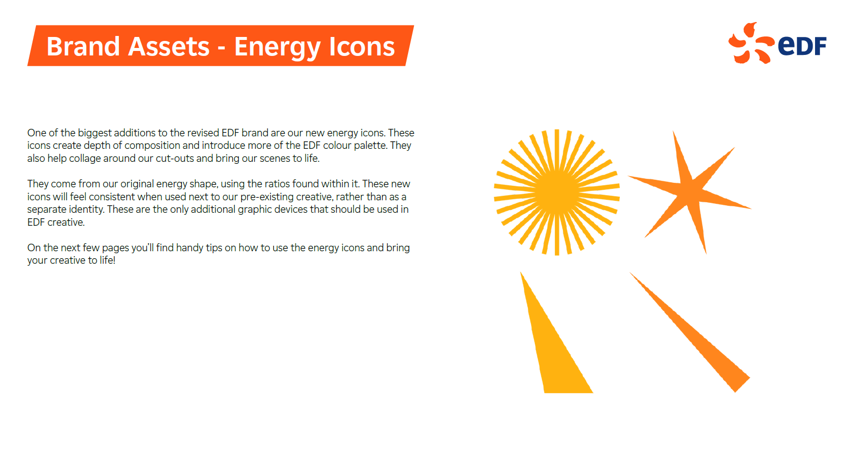
New brand assets
Existing components
The existing components in scope for change are:
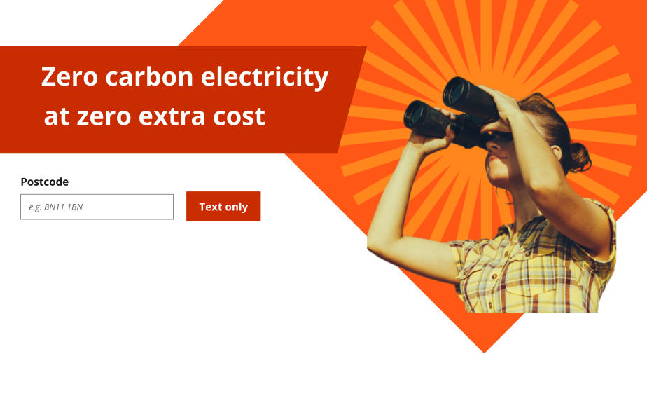
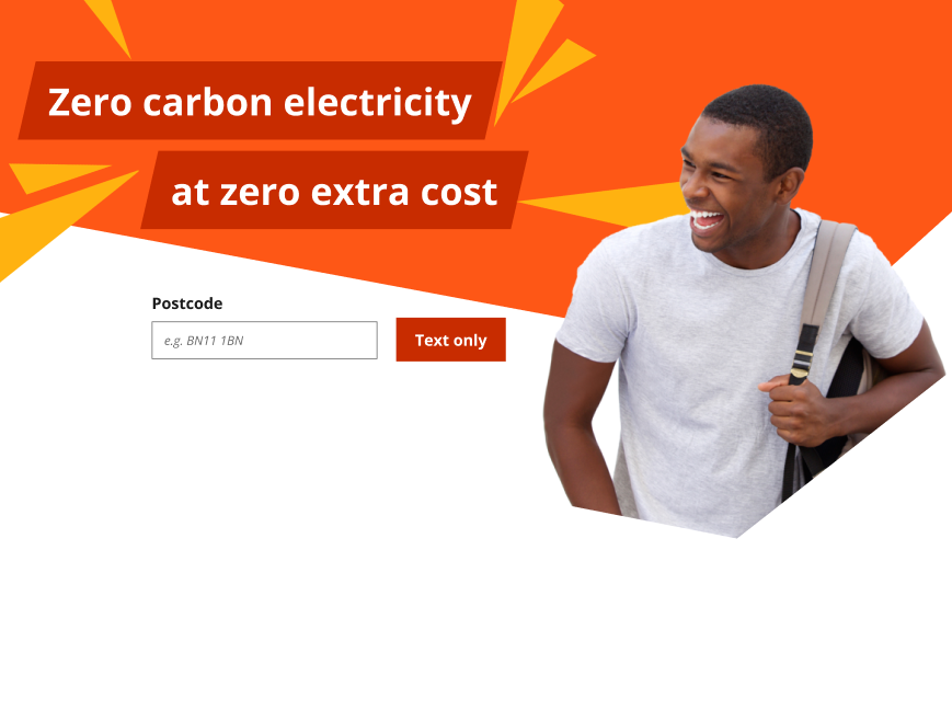
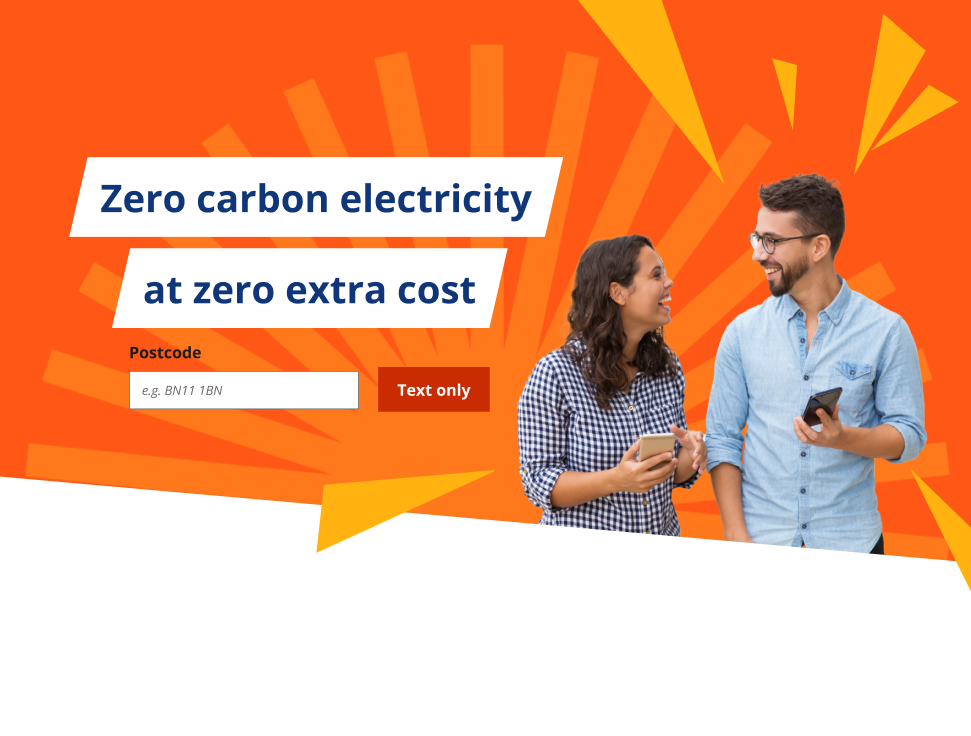
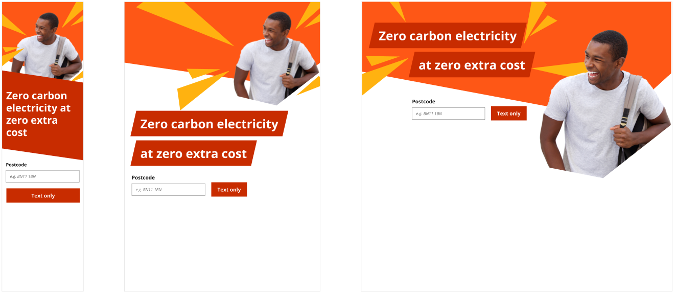
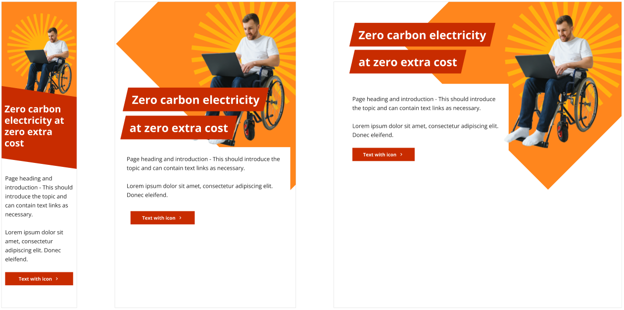
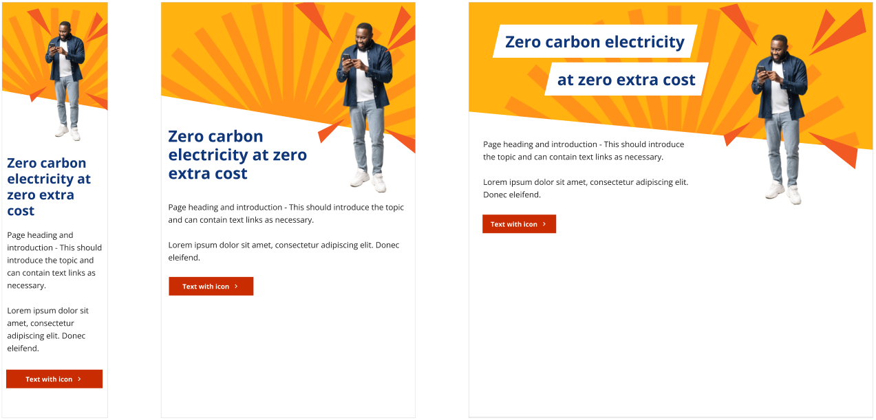
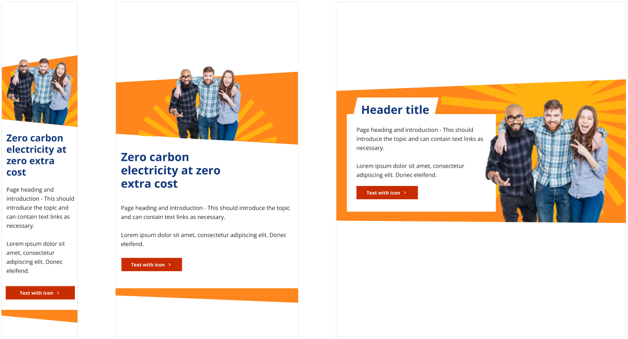
Homepage hero banner
Category banner
Product banner
Inline product
Title subheading
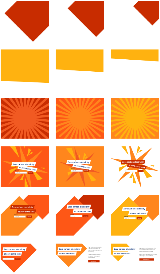
Initial exploration
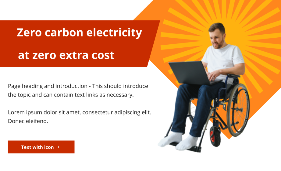
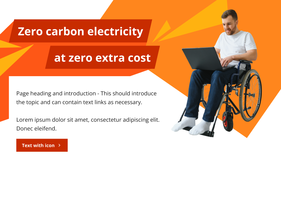
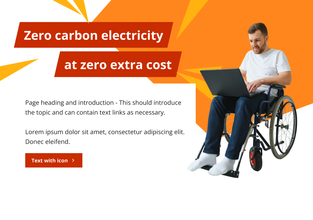
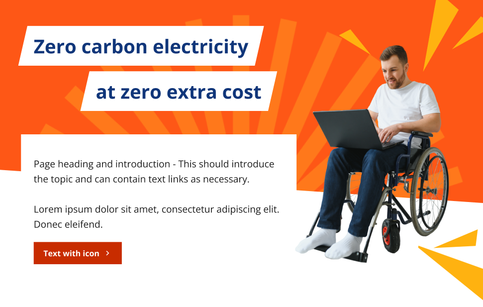
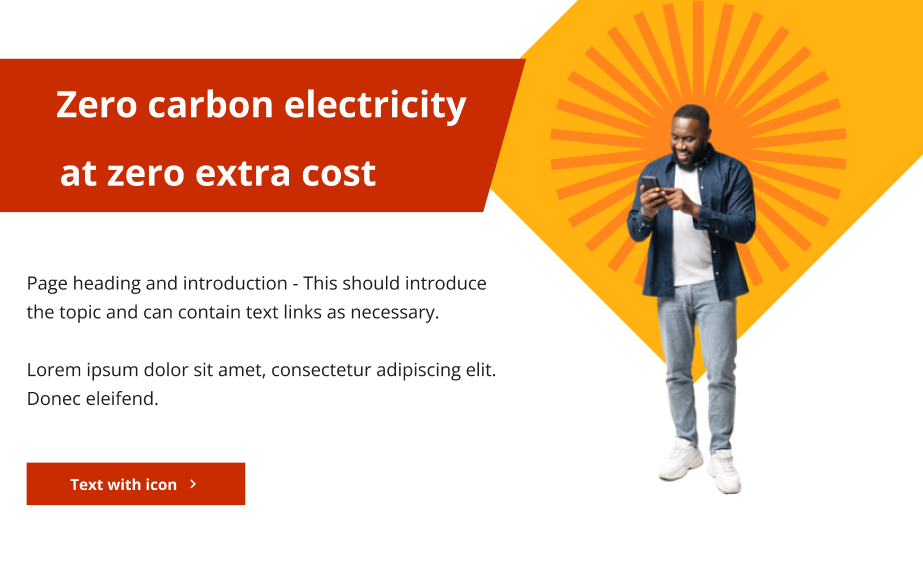
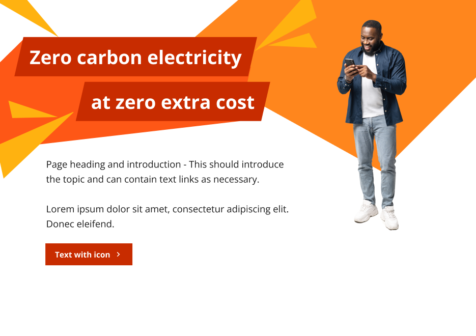
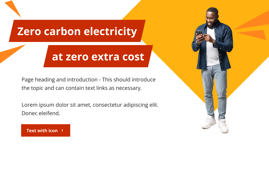
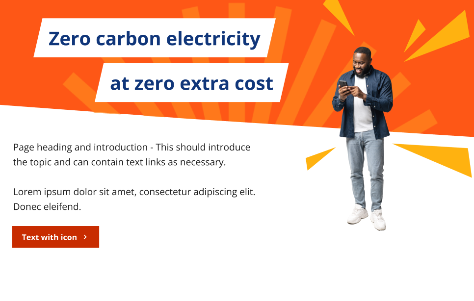
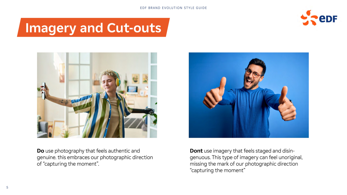
The initial exploration had no restrictions, except to use the new brand assets with the accompanying guidelines. The design team each took a different direction. I looked into a clean and fresh approach, using the collage as the key feature, which also incorporates the original brand guidelines.
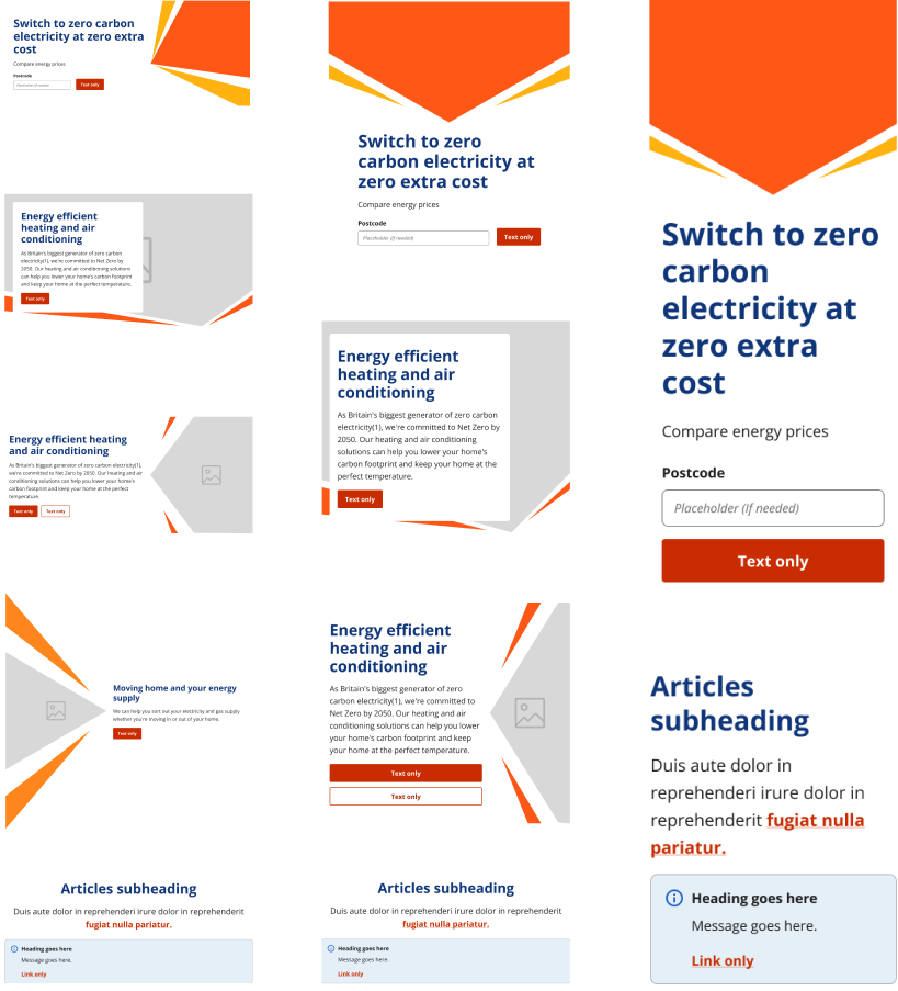
Translating the assets to digital
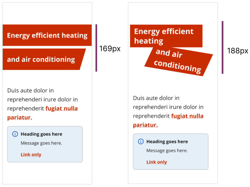
Potential challenge
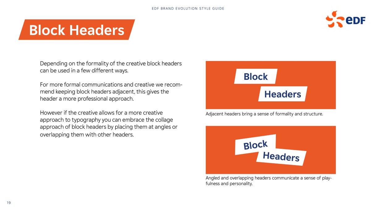
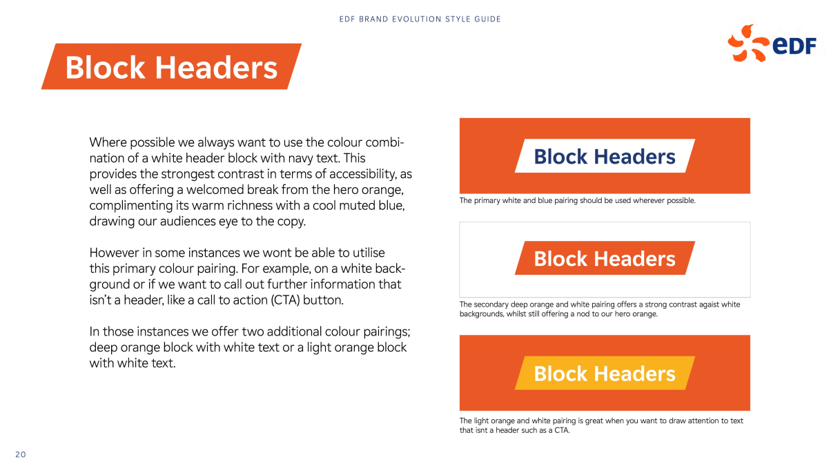
Components which work well in print don’t always translate the same way to digital. This can be due to accessibility, space or digital conventions. The block headers at angles take up a lot of space, particularly with angles and padding, and especially on mobile. These also look similar to the EDF CTA buttons, which could create confusion for the user. I tested these with the longest header we currently have to see how this would work in the worst case scenario.

Presenting and dot voting
Presenting back our designs to stakeholders, getting feedback and voting on the designs with the most potential for development.
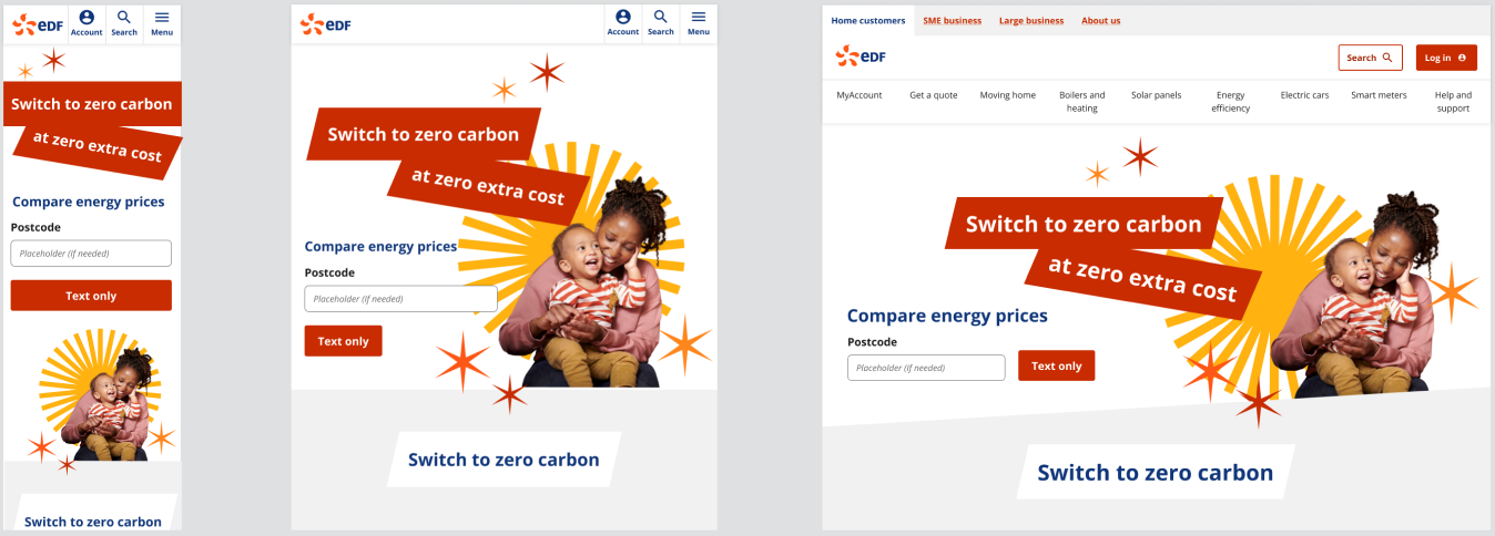
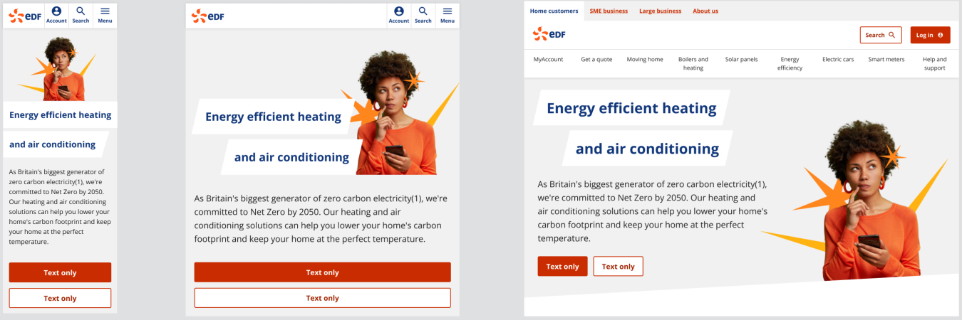
What resonated

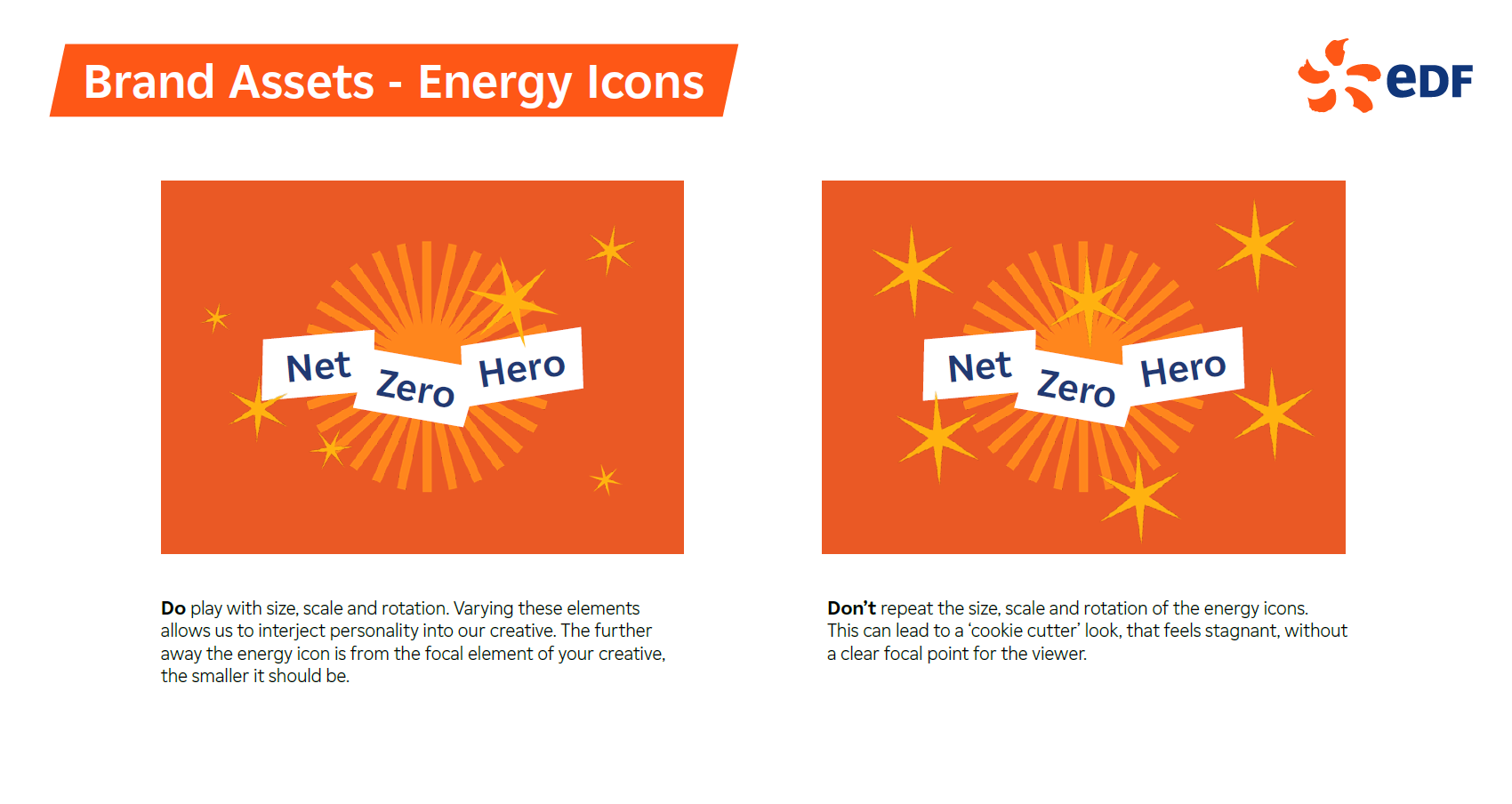
Scaling
Being playful with scaling shapes

Overlapping
Expanding images beyond backgrounds

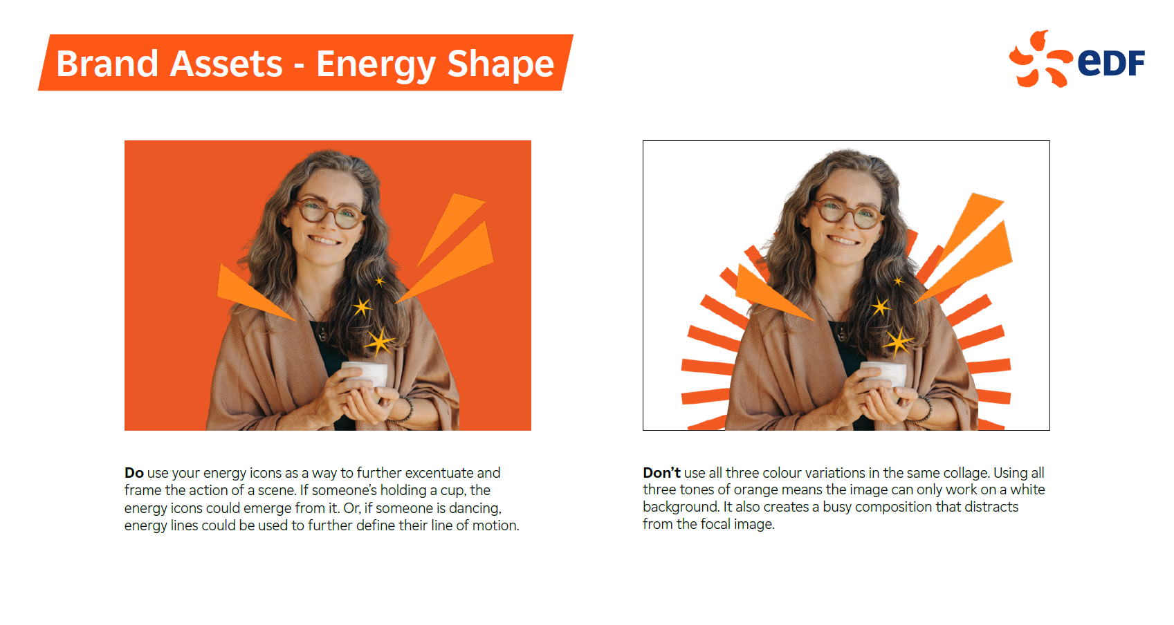
Colour
Strong use of colour

Angles
Using angles to divide the screen
Feedback for consideration

Rotation
Rotate shapes to create a natural look

Accessibility
Fed back to brand that some text and backgrounds don’t meet accessibility standards.
Process
Refining the design
With the feedback and considerations in mind, my approach to the next stage of designs were two-fold.
1. To establish a flow from homepage, through category to product page using descending colour and scale.
2. The homepage would have the largest amount of colour and least amount of text, the product page would be reversed.