
Navigation component
Client: EDF Energy
Apr - May 2023

Objectives
To create a responsive navigation component which will solves the user experiences challenges identified during recent user and CRO testing.
Without changing the information architecture, the component needs to enhance the product content, function structure and hierarchy, highlight core functions and also simplify the users journey.
Team
I collaborated closely with the design team and led workshop discussions, ultimately taking full ownership of the final design concepts and their execution.
Discovery
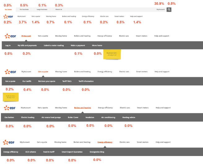
Data verification and baseline
We conducted CRO testing, corroborated by Google Analytics, revealing that menu items on the third, fourth, and fifth levels achieved less than 1% click-through rate.
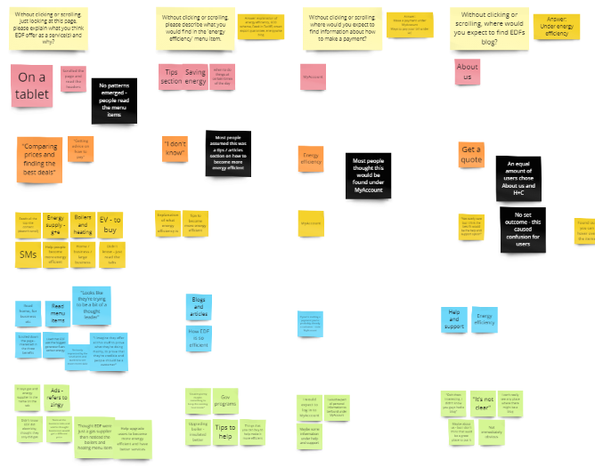
Baseline user testing
User testing uncovered user confusion surrounding certain menu items, such as "heat pumps," and a lack of awareness about EDF-supplied products.
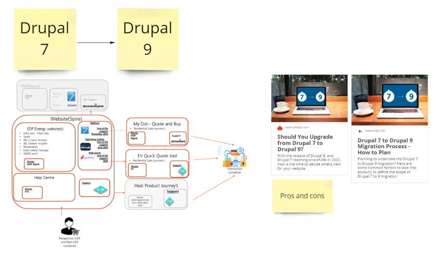
Technical constraints
By understanding technical constraints, we can ensure designs are feasible, page load times are reduced, responsiveness and scalability are ensured, and any risk is mitigated.
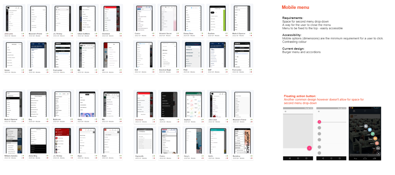
Devices
Researching different navigation designs and functionality across multiple designs helps identify current conventions.
Competitor benchmarking
We examined industry-specific and broader market practices to understand any established conventions, effective styles, or potential pitfalls.
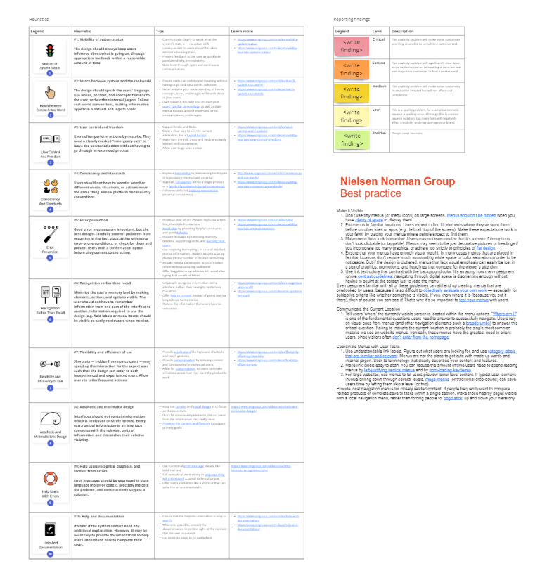
UX design principles
We conducted a comprehensive review to ensure our navigation component adheres to best practices, heuristics and design principles.
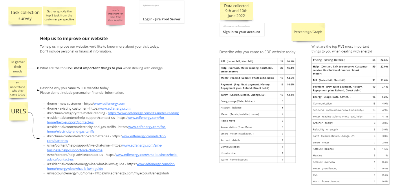
Top tasks
Surveys were undertaken to understand the users top tasks. This helps understand users needs, ensure task success, efficiency and satisfaction.
Establishing scope
Information architecture was later removed from scope to be included later in the project due to an upcoming Net Zero project.
Users goal
Our primary aim was to enable users to accomplish their goals with minimal friction in task completion.
Business goal
Our broader objective was to retain existing customers and attract new customers across the UK; to assist the company's expansion, growth, and increased profits.
Defining the problem
Our research identified several user experience issues with the current navigation component, including:
Accessibility
The design of the dropdown menu levels posed accessibility challenges for individuals with motor impairments.
Overload
Menus with three or four layers contained an excessive number of items for certain device widths.
Unexpected categorisation
Users struggled to locate specific items due to unexpected categorisation, although this aspect was beyond the project scope.
Unused menu items
Most menu items had a click-through rate of less than 1%.

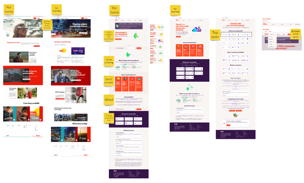
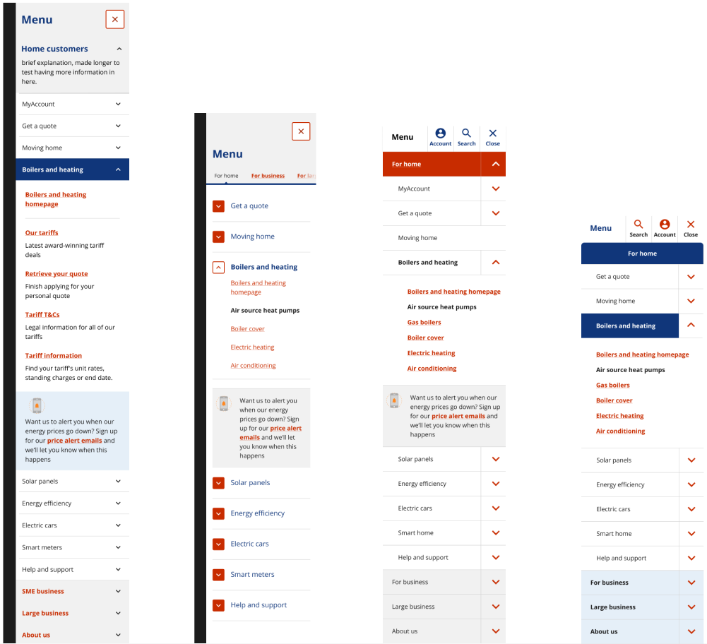
Developing desktop ideas
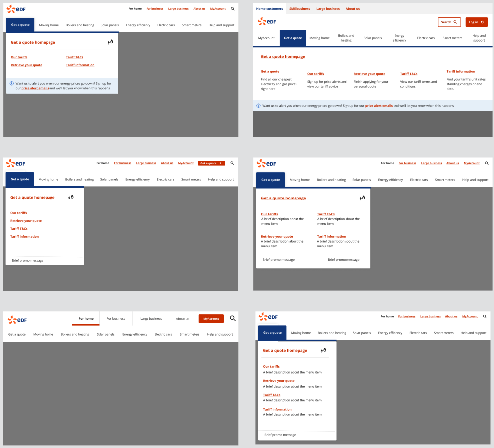
Developing mobile ideas
Process
Problem solving
All issues identified during the discovery phase were systematically addressed.
Brand pattern library
We aligned all menu elements with the existing design system, ensuring consistency.
Workshopping
I collaborated with the team to generate a multitude of ideas quickly.
Experimentation
We explored diverse design possibilities, iterated, and refined these to achieve designs which solved the identified user challenges.
Wireframes
We refined component elements to establish precise spacing and understand the restraints in the designs.
Design reviews
I presented ongoing work to the design team, Drupal team (including developers, stakeholders, and peers), and incorporated feedback given where appropriate.
Delivery
Tabs
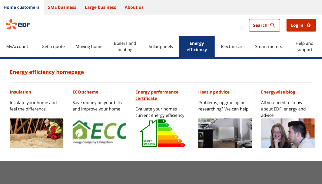
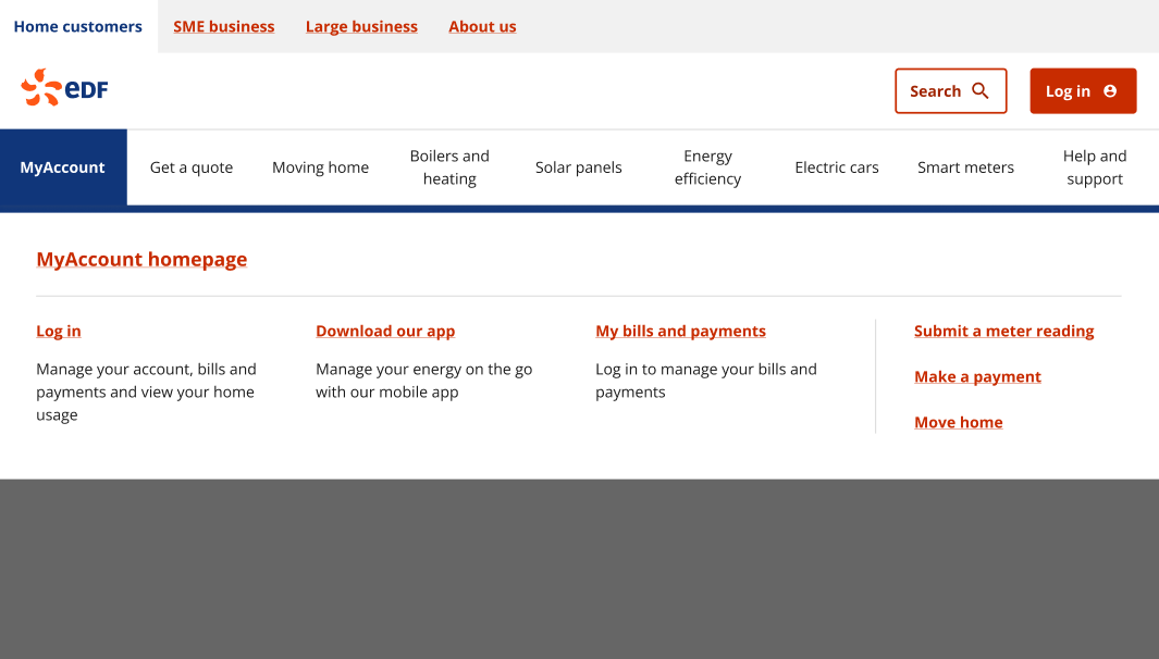
Menu items transitioned into tabs, with the title serving as the clickable element.
Search
We examined industry-specific and broader market practices to understand any established conventions, effective styles, or potential pitfalls.
Login
We conducted a comprehensive review to ensure our navigation component adheres to best practices, heuristics and design principles.
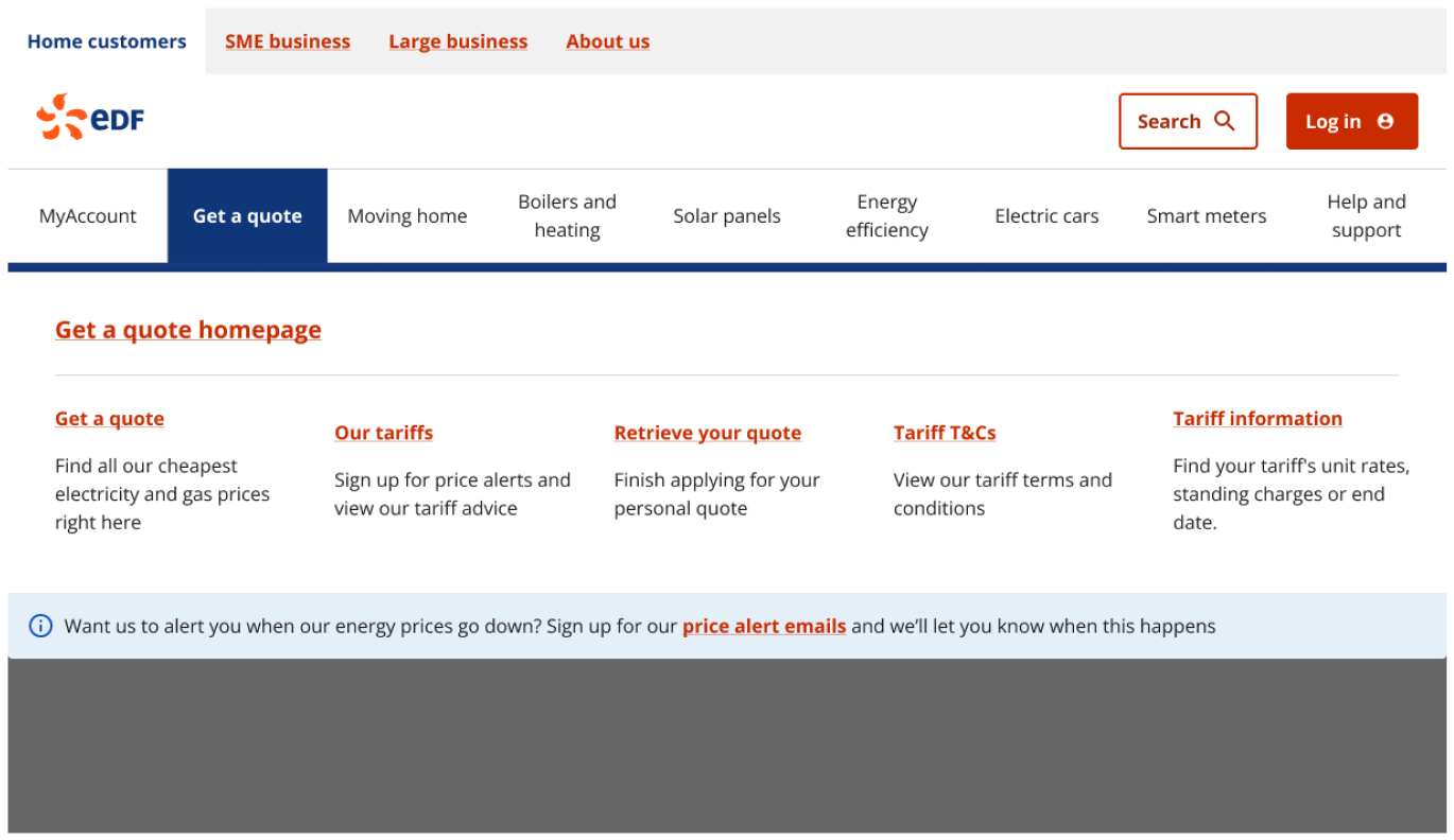
Descriptions
Each menu item now includes a description to aid user understanding.
Messages
Important messages are now presented on the menu, but placed under the menu items to avoid distracting users from their primary tasks.
Considerations
Design principles
We reduced the number of menu items to enhance usability while adhering to design principles (Hicks Law, Fitts’ Law and Millers Law).
Scalablity
The designs were crafted with scalability and flexibility in mind.
Accessibility
The desktop and mobile designs adhere to WCAG guidelines to ensure accessibility for all users.
Defining component rules
Rules for categories
We established clear rules and restrictions to maintain design best practices, including the selective use of images and streamlined presentation of categories.
Service categories
Every menu item is now accompanied by a descriptive text to provide users with a clear understanding of its content.
Product categories
Products like 'Gas boilers,' 'heat pumps,' and 'EV chargers' will feature descriptions and dedicated images, enhancing user comprehension of these products.
Services over 5+
The top three menu items, deemed most significant either by the business or through analytics, will be prominently displayed, while the remaining items will appear in a list format on the right-hand side of the page. The desktop and mobile designs adhere to WCAG guidelines to ensure accessibility for all users.
Iterating
Unmoderated user testing found:
Positive feedback
User feedback on the menu component was overwhelmingly positive. Users found the descriptions helpful and easily navigated the component.
Messaging
Users did not notice the messaging at the bottom of the category blocks, and distinguishing between informational and promotional messages was challenging. Consequently, these messages were removed from the design.
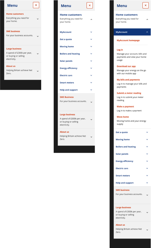
Mobile
Mobile vs desktop
Although the same information should be shown across multiple devices, a collective decision was made to exclude images from the mobile menu due to limited screen space on mobile devices.
The description will remain on the mobile screen, as this tested well and was appreciated by users. This also takes less space than images and was perceived as being more valuable.