Travel booking
Client: UXDI / University of Glasgow
Jan-Jun 2022 - designs updated 2023
Objectives
A start-up hotel company are looking to create an online experience that is fast, easy, intuitive and based on a deep understanding of their online audiences.
Deliverables
To produce a responsive hotel booking site which overcomes friction and pain points users experience on competitor websites.
Team and role
Solo project, user research and user interface design.
Discovery
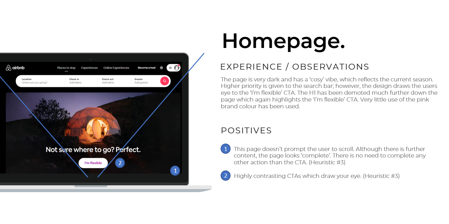
Competitive benchmarking
I conducted a heuristic review to understand which elements should be emulated, which should be improved and which conventions should be followed.
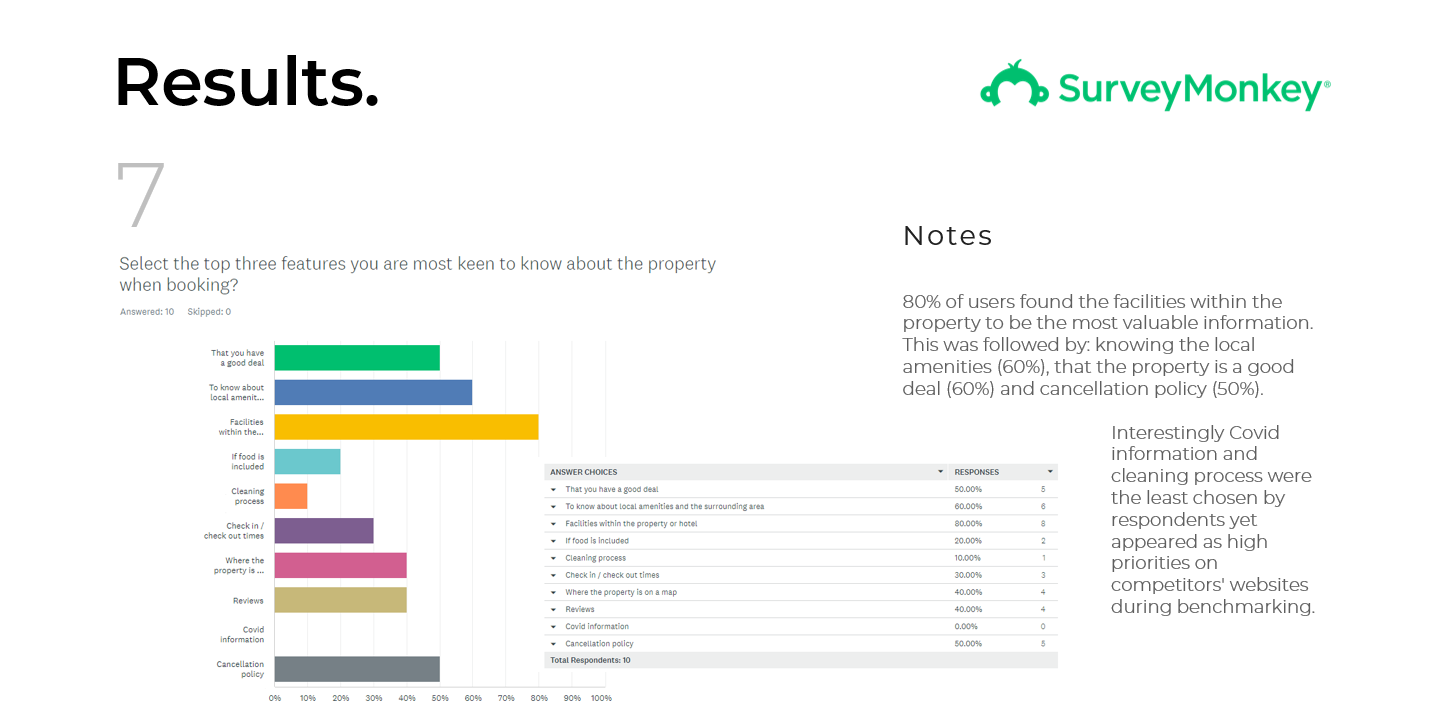
Online survey
The online survey helped me address the questions which stemmed from the heuristic review and to find out more about users behaviour.
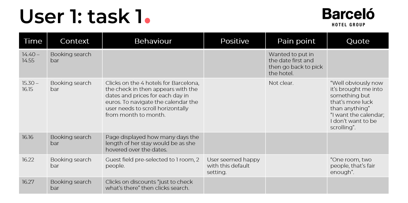
Moderated testing and note taking
Watching users undertake tasks helped further understand the differences between observed versus proclaimed behaviour. This provided invaluable insights and also raised questions which I could then focus on during my own user testing.
Defining the problem
Personas
Creating Anna was a helpful tool in organising the data and ensuring the appropriate content for users were considered and prioritised. My persona, except for the personal details, was created solely from data rather than assumptions.

Affinity diagram
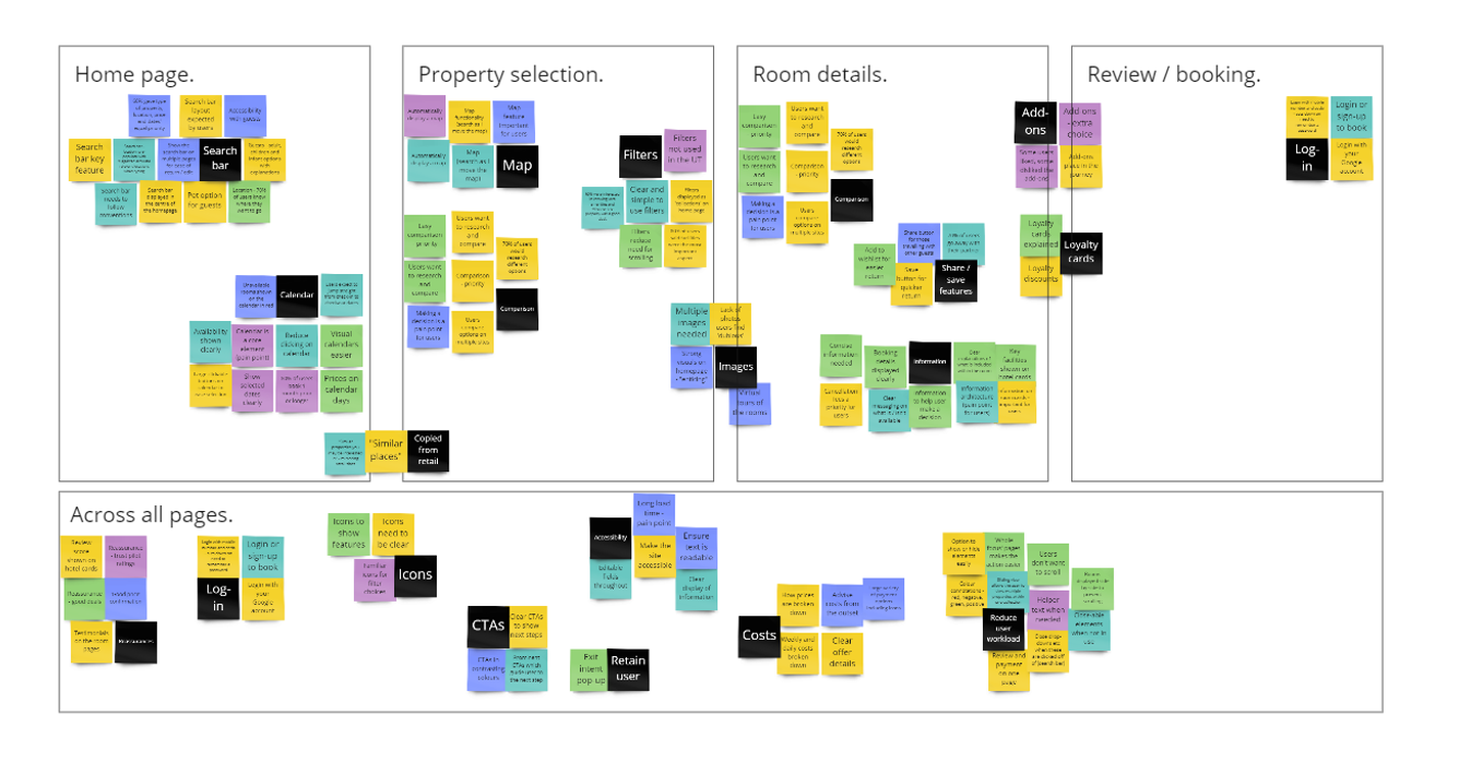
Collating the information from the discovery phase and grouping these onto set pages helped identify patterns and priorities for each stage of the users journey.
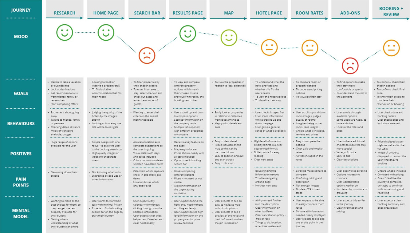
Customer journey mapping
Breaking the journey into a visual story showing mood, goals, behaviours, positive interactions, pain points and users mental model will aid the development stage.
Developing
User flow
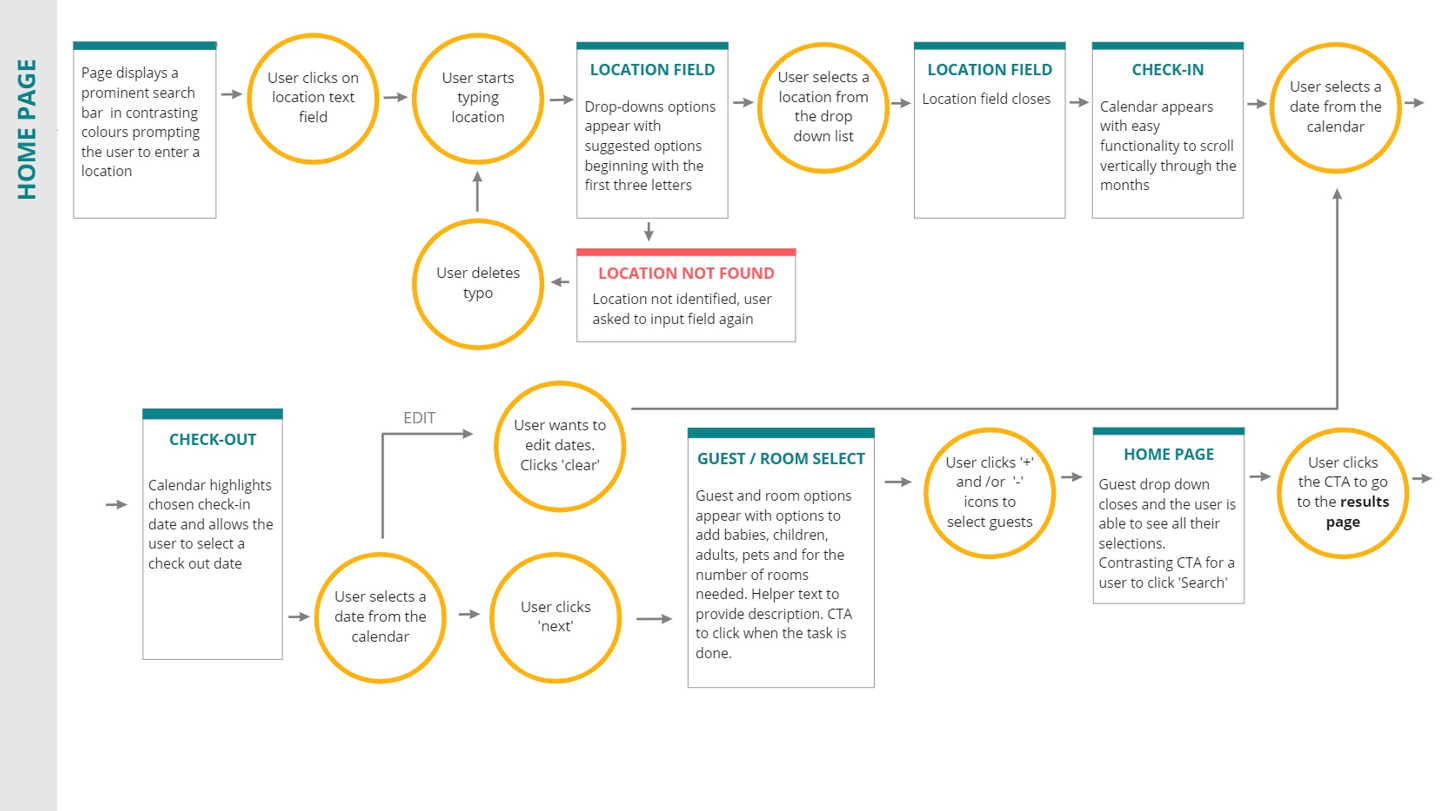
Creating a deeper knowledge and understanding of the online journey and flow of information.
Initial sketches and wireframes
Planning the screens quickly, based on research found in discovery, to solve friction points.
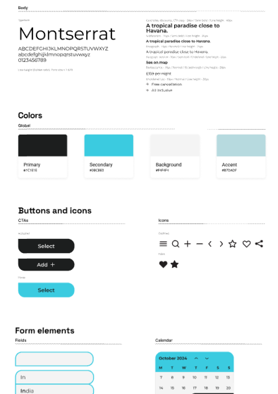
Design system
Brand and pattern library
I created a pattern library to ensure clarity, consistency and accessibility within the designs.
Accessibility
Ensuring all pages align to WCAG guidelines and meet accessibility.
All text meets AAA colour contrast requirements.
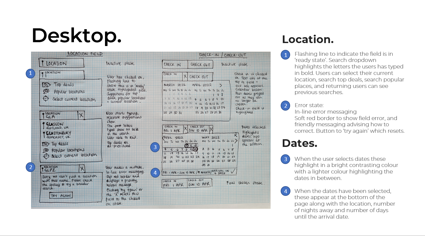
Desktop design
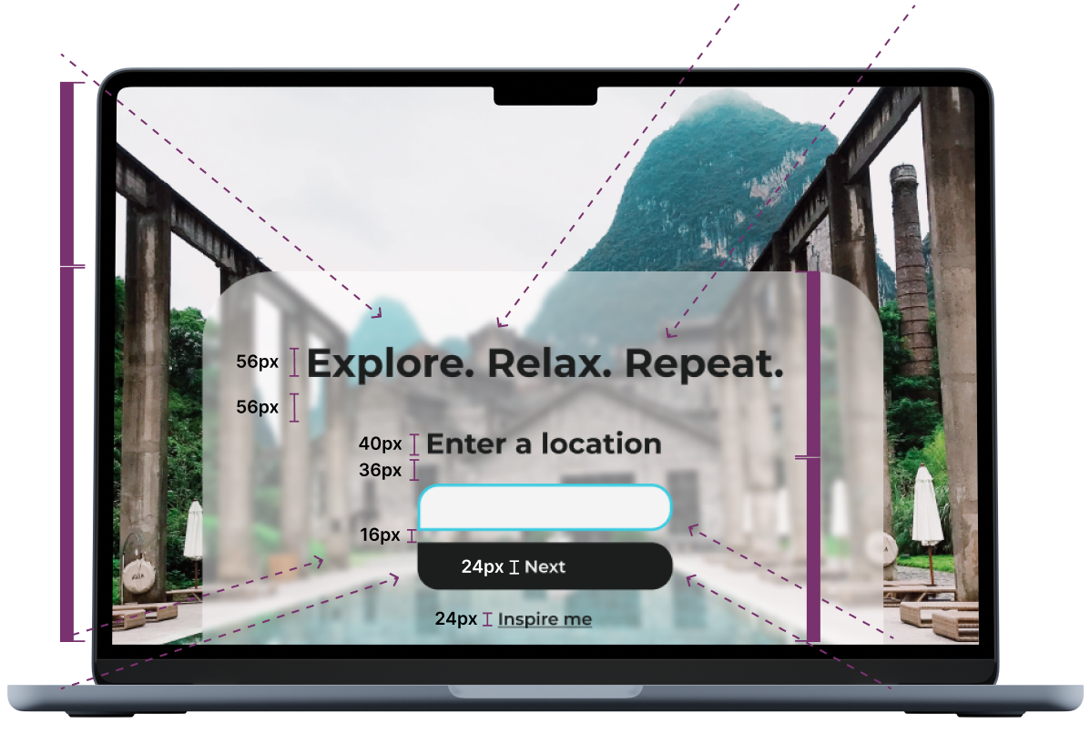
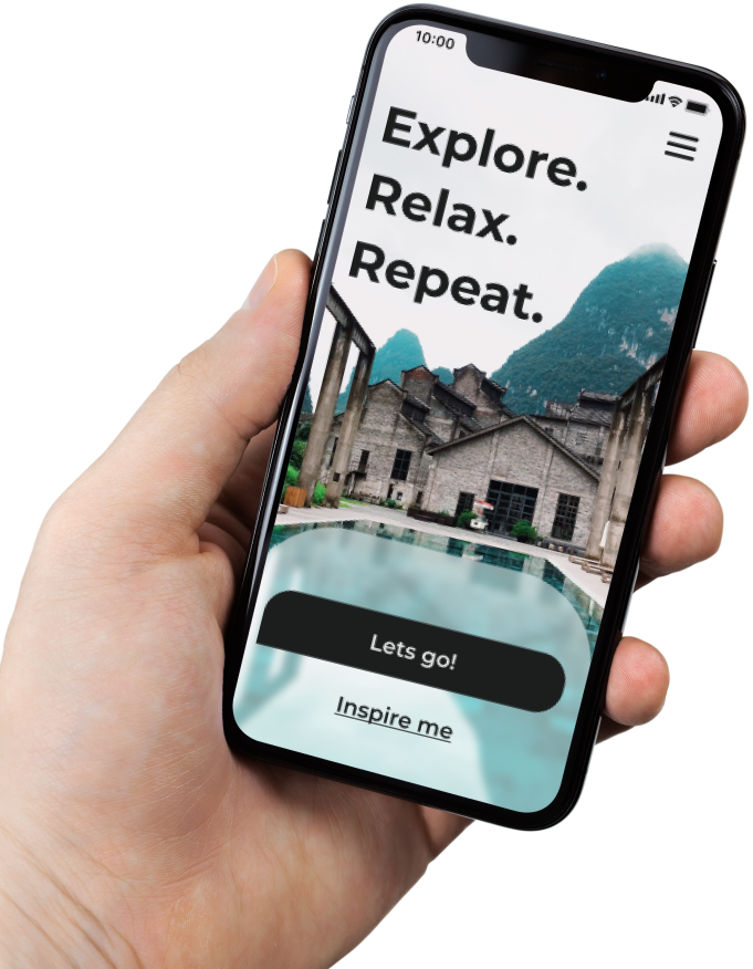
Glassmorphism
Glassmorphism adds a veiled layer of transparency, this is created through a mix of layering, opacity, and blur value.
Negative space
The triangular shape created by the white sky allows the user to focus on the primary action of this page and the secondary ‘Inspire me’ action if needed.
Directional cues
Used within the background image, this is a visual element that guides the users eyes toward strategic areas of the landing page, such as the call to action.
Rule of eight
All spaces and font sizes are divisible by eight to ensure consistency in the design.
CRO testing
Previous A/B testing has shown single focus action pages are more effective at helping users to progress through a form. This initial introduction eliminates all noise and has one single focus.
Previous CRO testing has also found that within a journey ‘Next’ to be the most non-committal phrase in a journey to proceed.
User feedback
The highlighted text field shows the user this is an active state for the user to begin.
Gestalts principle of proximity
Things that are close together appear to be more related than things that are spaced farther apart.
User testing
Research showed large images were important to users and that deeper / darker colours looked more luxurious.
Touch target
Larger than accessibility regulations, the primary ‘happy path’ touch targets are designed to be more inviting to the user.
(356 x 66px)
These sizes are mirrored on mobile devices.
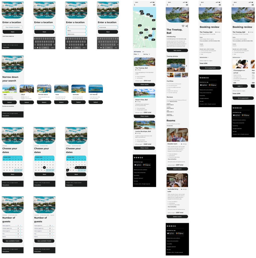
Mobile design
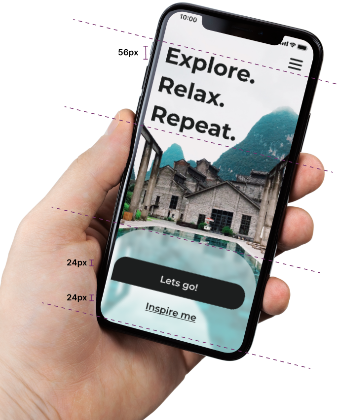
Rule of eight
All spaces and font sizes are divisible by eight to ensure consistency in the design.
User testing
Research showed large images were important to users and that deeper / darker colours looked more luxurious.
Rule of thirds
Helps to arrange elements within a composition in a more harmonious, balanced, and aesthetically pleasing way. One third image, two thirds focus.
Touch target
Larger than accessibility regulations, the primary ‘happy path’ touch targets are designed to be more inviting to the user.
(356 x 66px). These sizes are mirrored on mobile devices.
Glassmorphism
Glassmorphism adds a veiled layer of transparency, this is created through a mix of layering, opacity, and blur value.
Negative space
The triangular shape created by the white sky allows the user to focus on the primary action of this page and the secondary ‘Inspire me’ action if needed.